
When a brand colour moves from screen to fabric
Pair a digital reference with a physical sample.
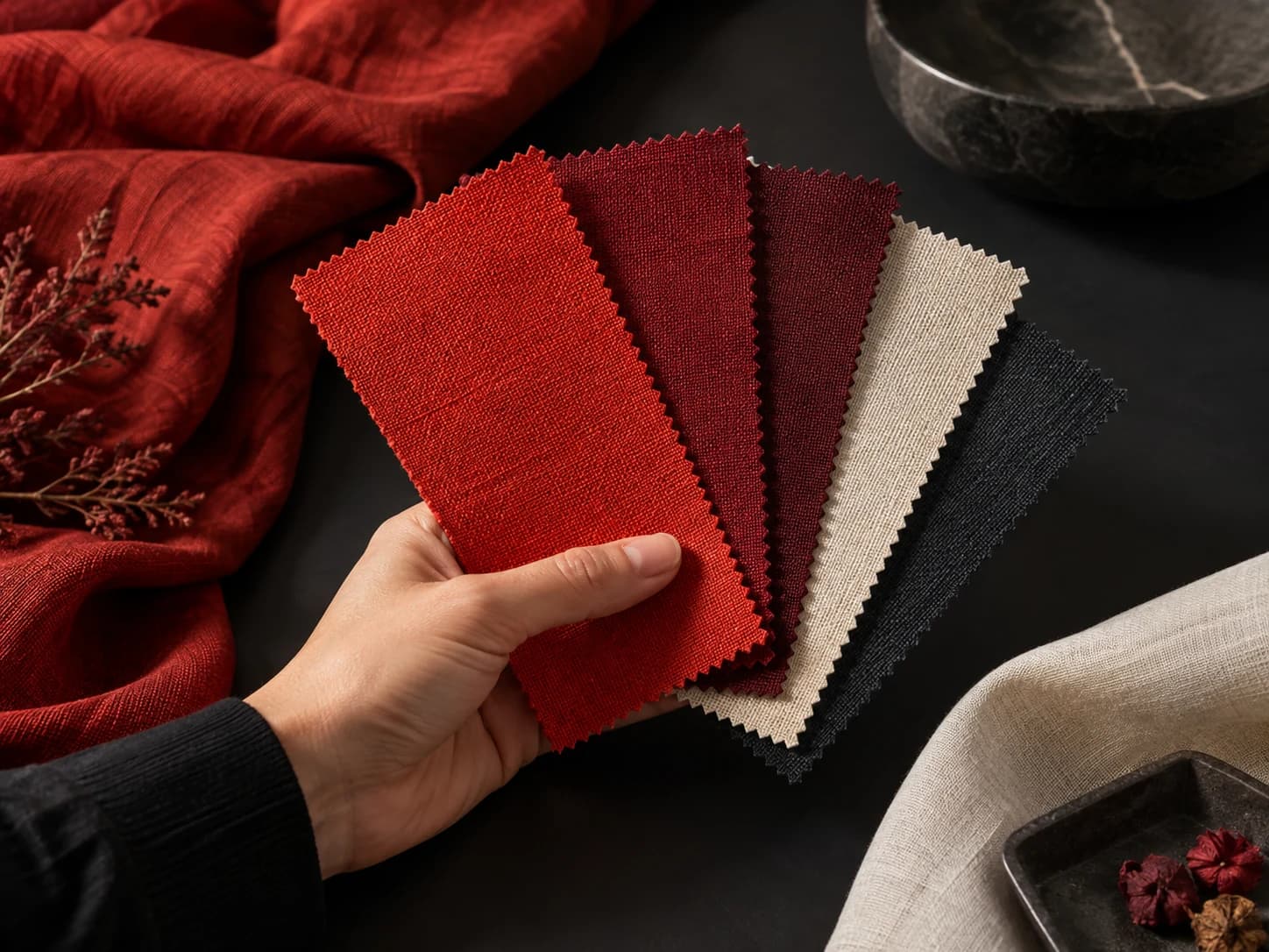
A brand’s red or black may be familiar, but seeing it on a new material is a separate step. Screen brightness and photographic lighting make comparisons harder. Reviewing physical samples under the same conditions gives the colour discussion a clearer basis.
Agree on one approval reference
Record which fabric and garment the colour is for. Place the collar, main fabric and trims together if they will share a garment. Instead of simply asking for “a little brighter”, identify the sample you are comparing against. Keep the final approved version separately.
Once the colour is chosen, include that reference in production discussions. It also provides a consistent starting point when placing a repeat order.
Let’s take the idea further.
Tell us about your collection. From the first question to a finished sample.